Overview
Pip is a small GPS and activity tracker for dogs and cats developed by a company called Petsimpl. It attaches to your pet’s collar and sends an alert to your phone with your pets exact location if your pet leaves a safe area. You can also send out an alert to neighbors and friends. Pip uses a cellular data connection to transmit the GPS location of your pet, so even if your pet manages to run across the country, you’ll be able to see its exact location.
The Difference
The trackers that are currently available are bulky, have poor battery life, and expensive monthly fees. In contrast, Pip is small, with excellent battery life, and offers additional features beyond GPS. Pip is designed so that you can attach it comfortably and securely to your pet’s collar. It is durable and weather sealed to ensure that it can withstand the rigors of an active pet’s life; even if your pet is a swimmer. The battery in Pip lasts up to 3 months on a single charge, meaning that you only need to charge it a few times a year.
The Problem
Right now, the pip branding is somewhat vague in its visual approach. While the current logo does give you some idea of how the device works, it is simply a play on how technology works and does not specifically represent what the tracker does or how it relates to animals. For the solution I tried to convey the importance of the product and how this specific technology helps pet owners. I also stayed away from the satellite waves symbol that they currently use, as I believe it is an overused symbol. For my final design, the mark is something that is memorable as the Pip logo without the name having to be present in every iteration.
Current Logo
Brand Design Process
Final Re-Brand
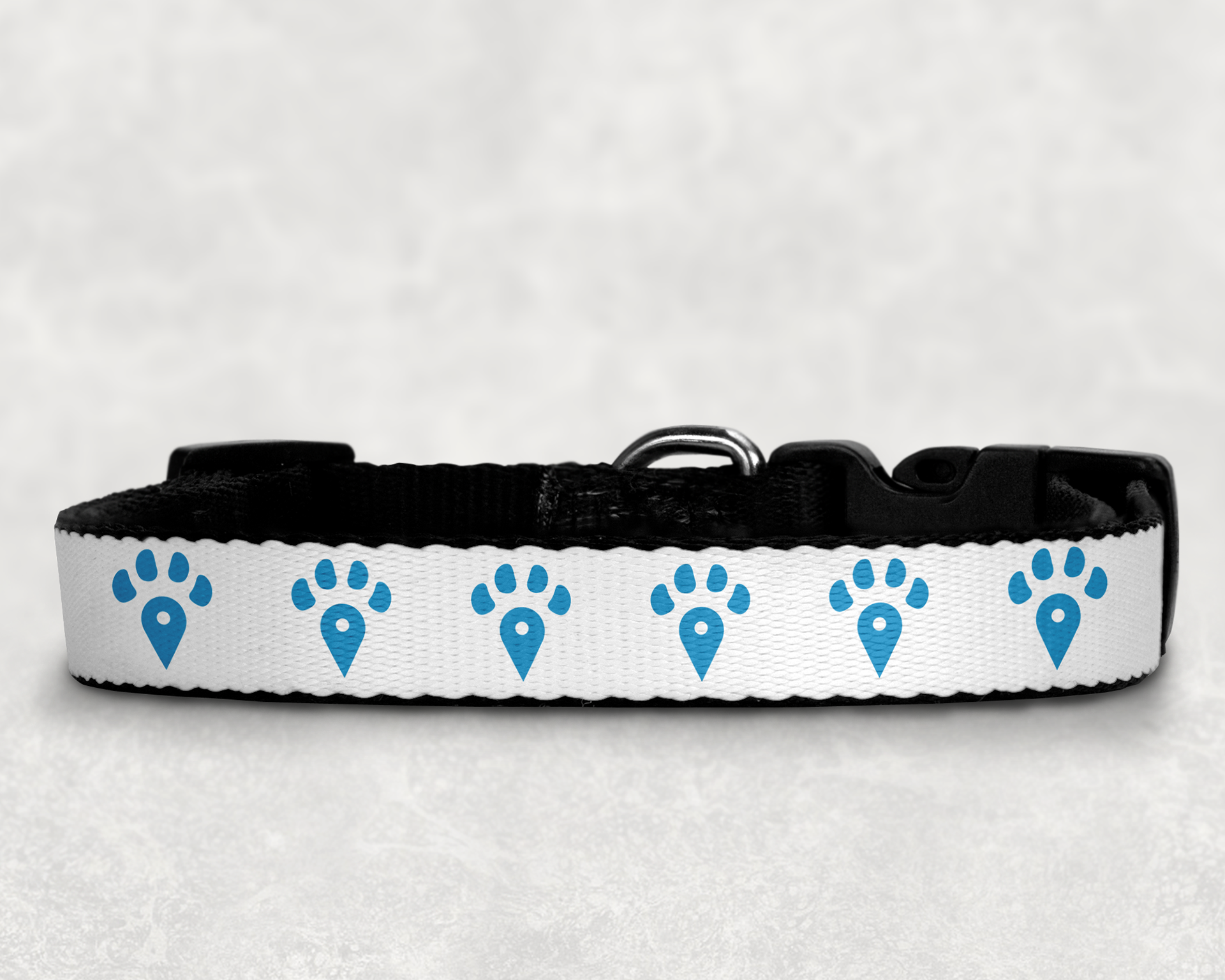
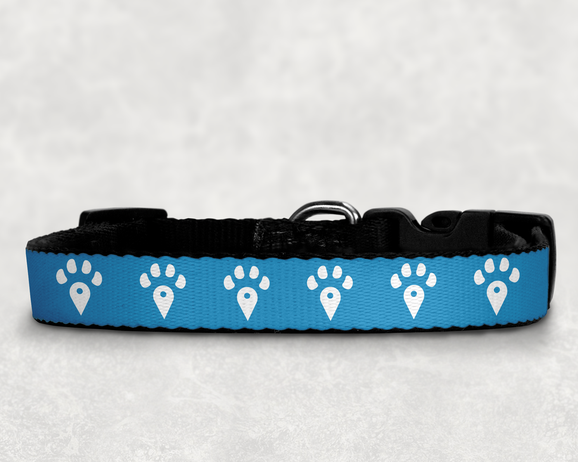
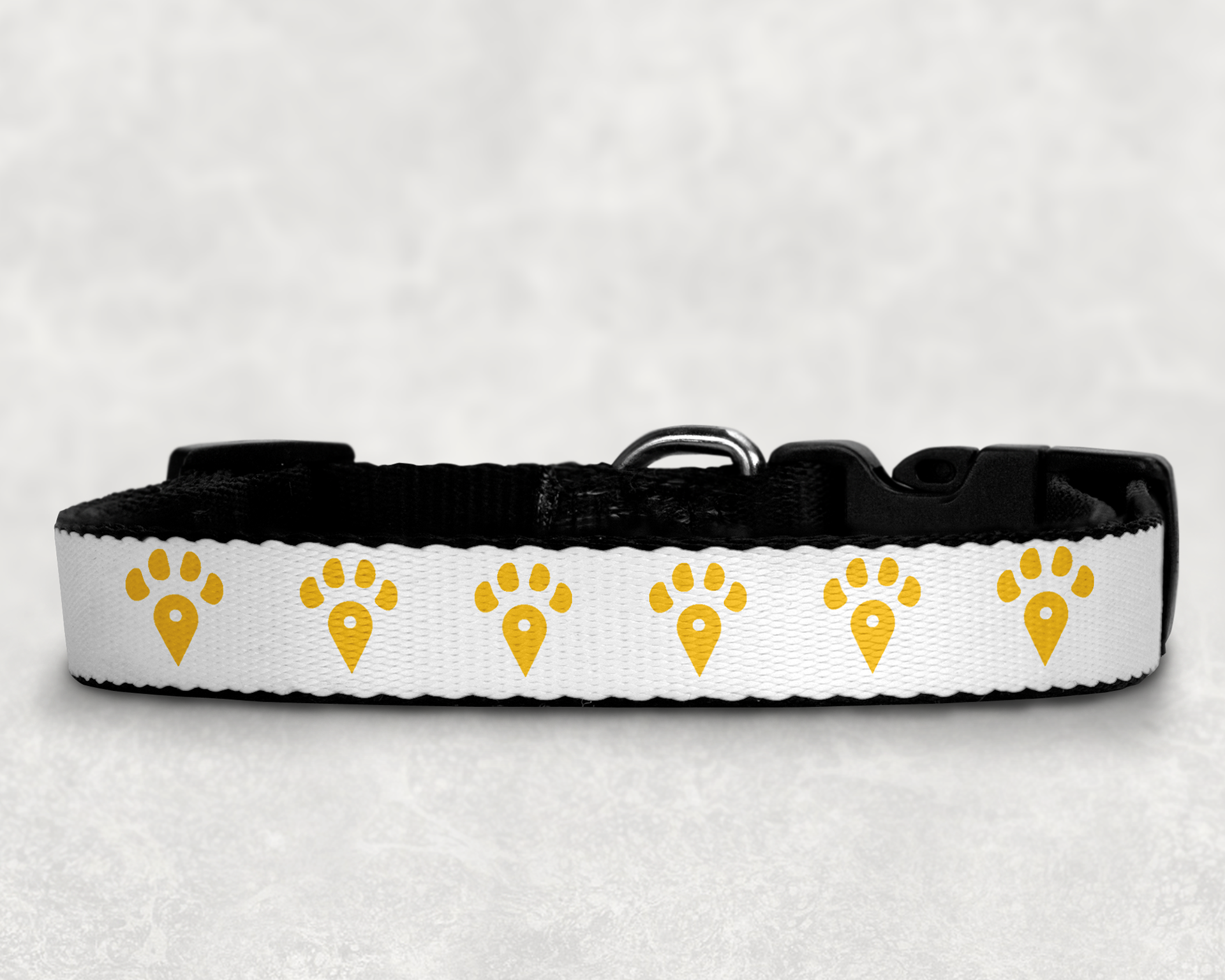
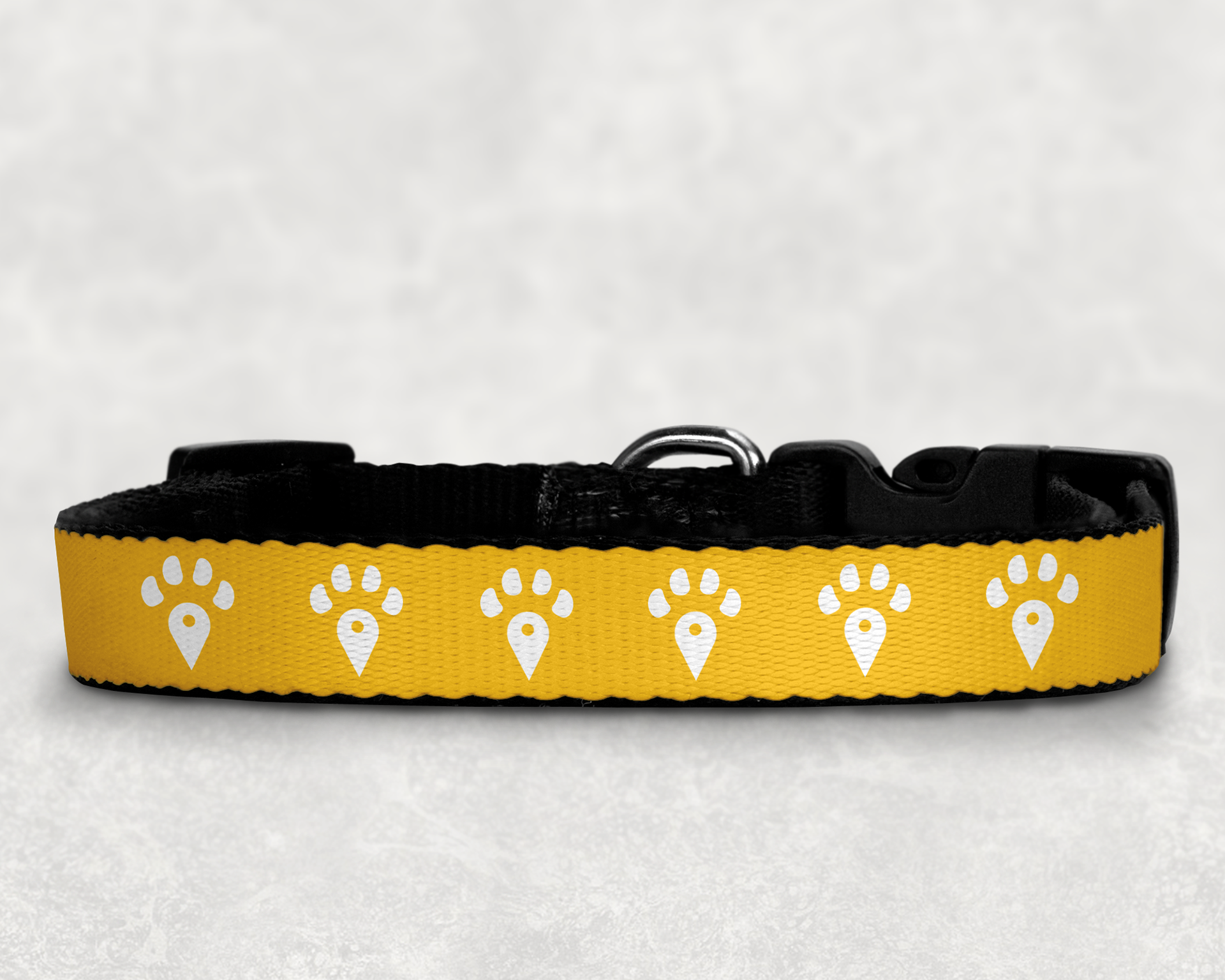
For the final brand I used the companies' existing brand colors to develop a logo that combined the gps tracking symbol with a paw print. I tried to convey the importance of the product and how this specific technology helps pet owners. I also stayed away from the satellite waves symbol that they currently use, as I believe it is overused. My main goal was to make a mark that is memorable as the Pip logo without the name having to be present in every iteration.
Primary Logo
Secondary Logo
Color Palette
Type Palette
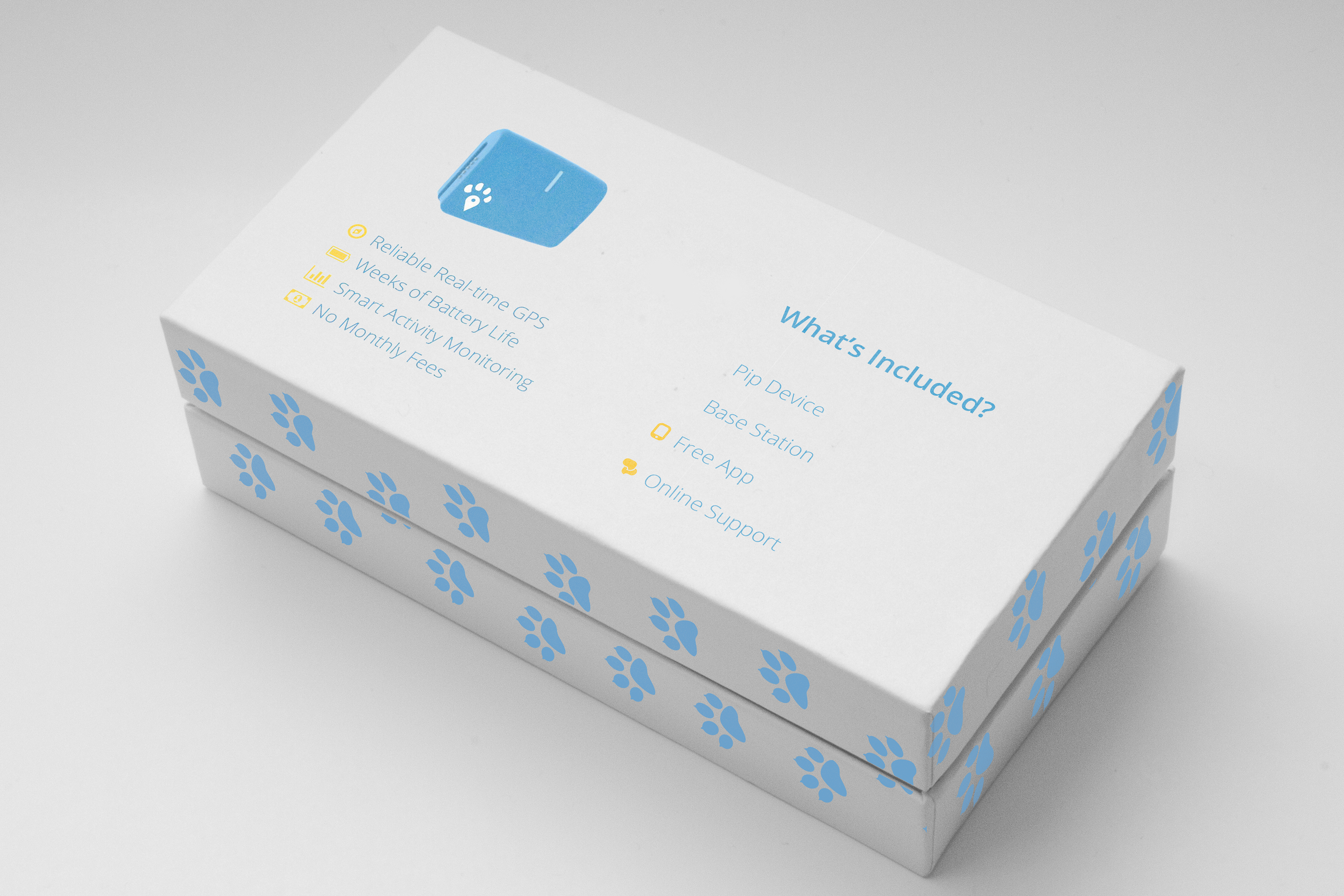
Packaging

Branded Touchpoints


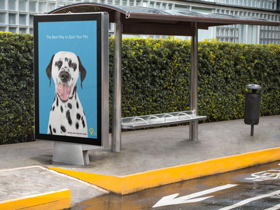
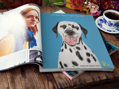
Ads
